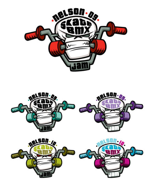
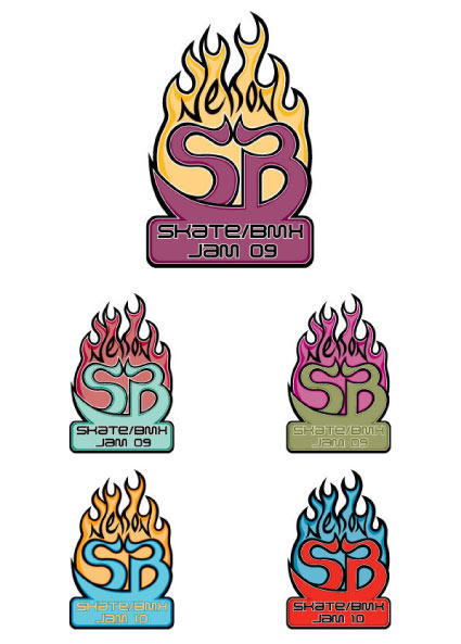
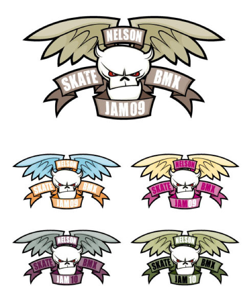
The logo designs that didn't quite make it!
I've recently been busy adding a load of 'never before seen' artwork to my various portfolio galleries. There's quite a lot of new stuff in general, but especially in the 'logos' section of my portfolio.
When coming up with a logo for any company there's obviously a lengthy design process that involves lots of different thoughts, concepts, designs and ideas. This can sometimes lead to some extremely varied designs from which the client choose a favourite and eventual winner. The unwanted designs unfortunately get left behind whilst the one winning design gets developed into the final logo. Sometimes these 'losers' aren't necessarily bad, just simply not right!
So, rather than let these design orphans go unloved any longer I've decided to boost their confidence and give them their own galleries. Check them out and let me know whether you think the clients made the right decisions and chose the best logo for the job! Oh, and if you can give any of the orphans a good home then we can start the rehoming process immediately! Loser logos 01 and loser logos 02!


I would love to know what you think. Enjoy!