Epic Logo Design Corporate Identity
Client: We Are Epic
Project Type: Logo Design / Corporate Identity / Branding
I was asked to help design the new corporate identity, logo for We Are Epic (Epic for short). I’d been working with the Leicester based design company for some time, and therefore had a good idea of the type of business they are and what style of branding would work for them.
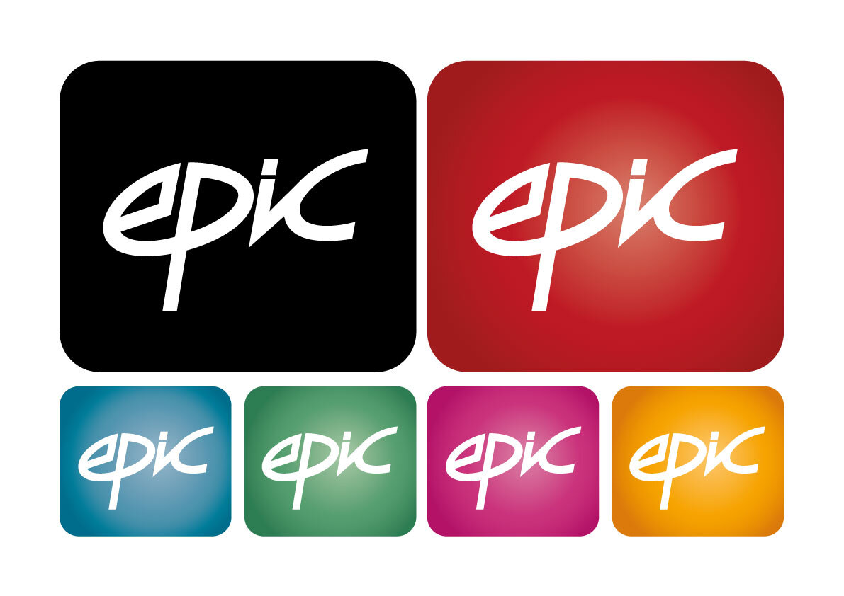
We worked closely together to come up with a text based design, simply concentrating on the word 'epic'. The new branding needed to be fresh but fun, with the ability to use the logo in many colour schemes including a single coloured version. I tried a variety of text styles in an attempt to get the 'feel' of the brand just right. You can see my first stage of designs below with squares to test the logo on a variety of colours. I've also added my initial sketches so you can see exactly where my design process begins.


