Sweet character and logo design project
Selection Fox - Dapper fox in his stripy socks!
I recently had the pleasure to work on a great new character and logo design for a fantastic new company named 'Selection Fox'.
The business is an online sweet / candy ordering service. You choose your favourite tasty treats and they'll pick, pack and post the parcel of perfection direct to you - Awesome!
The name is obviously a play on the traditional 'selection box'. Therefore with a small leap of creative genius 'Selection Fox' was born.
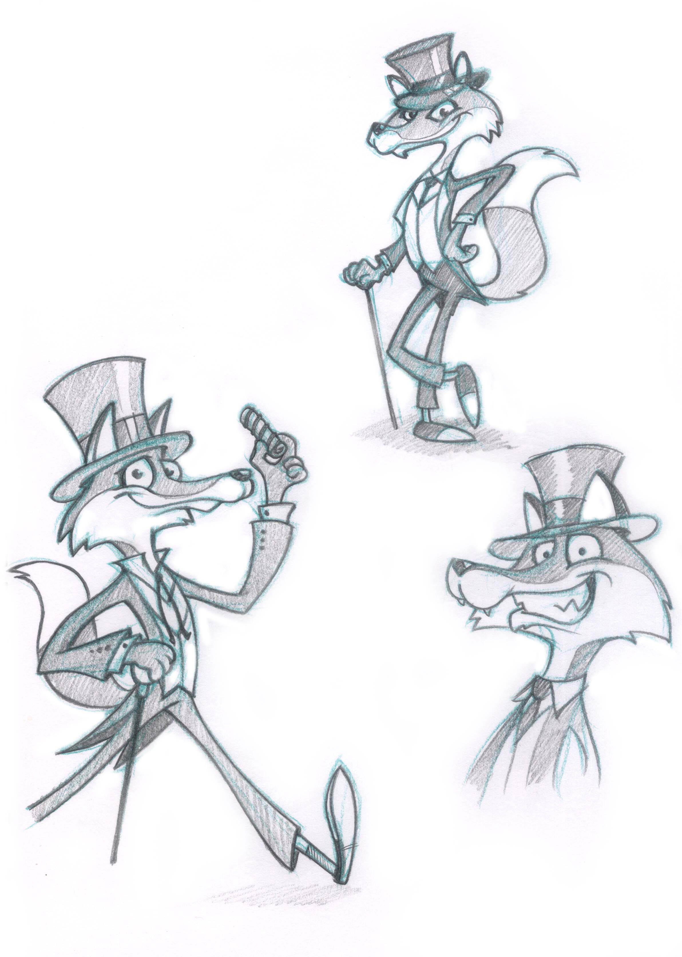
Our new character needed to be (a) a fox and (b) a suave, sophisticated and cool as candy old school dandy :)
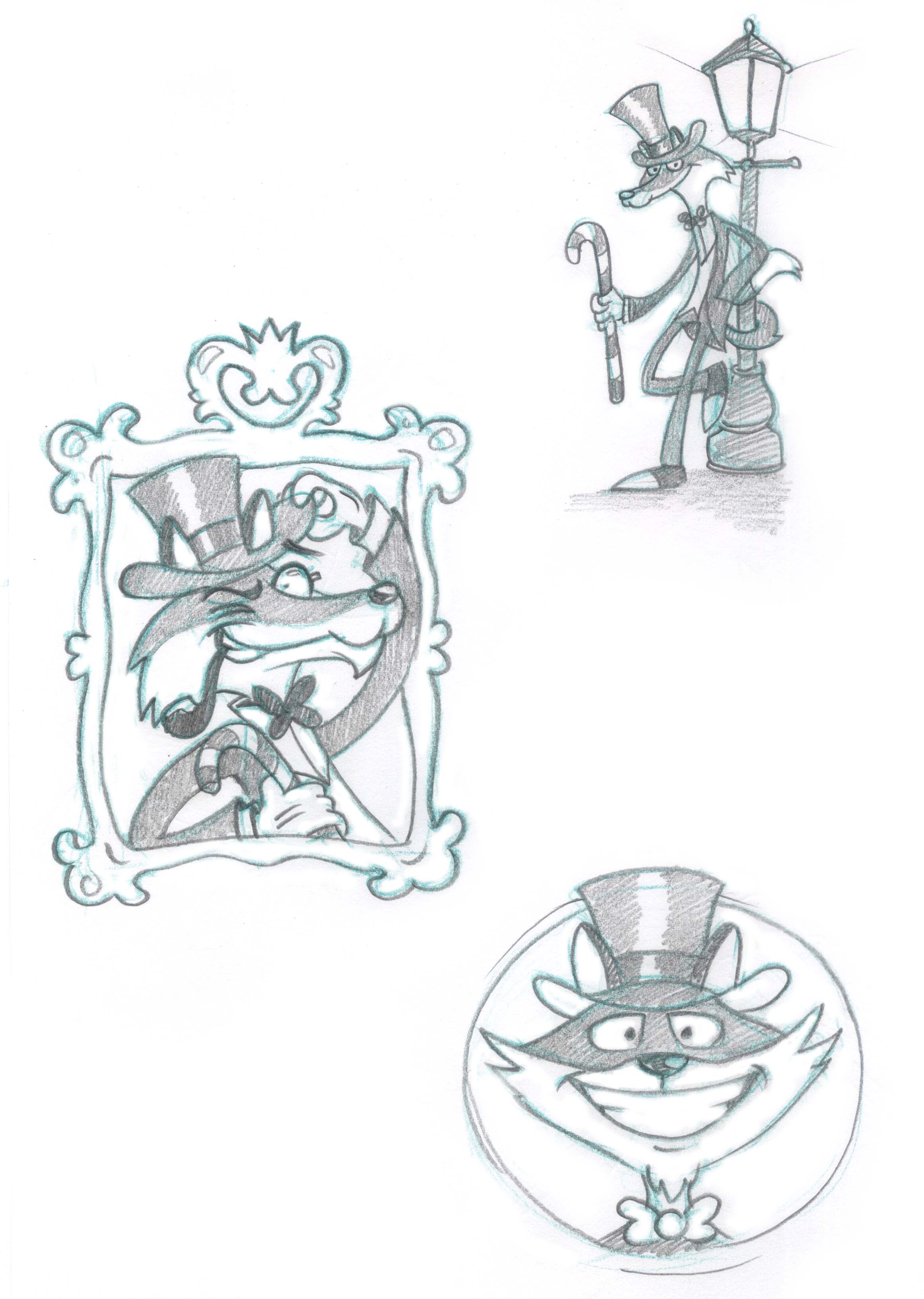
The top hat and tails seemed an obvious choice, with the candy cane, sweet bow tie and liquorice pipe finishing off his sophisticated demeanour.
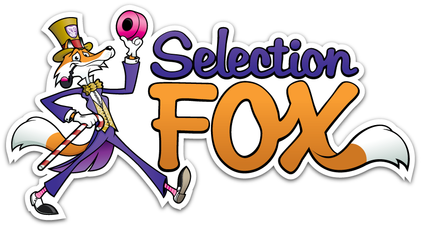
Purple was an obvious choice of colour next to the foxy orange hues, and all that was left was to add a giant liquorice allsort in his other hand. And lastly what dapper fox would be seen without his super, stripy socks?!
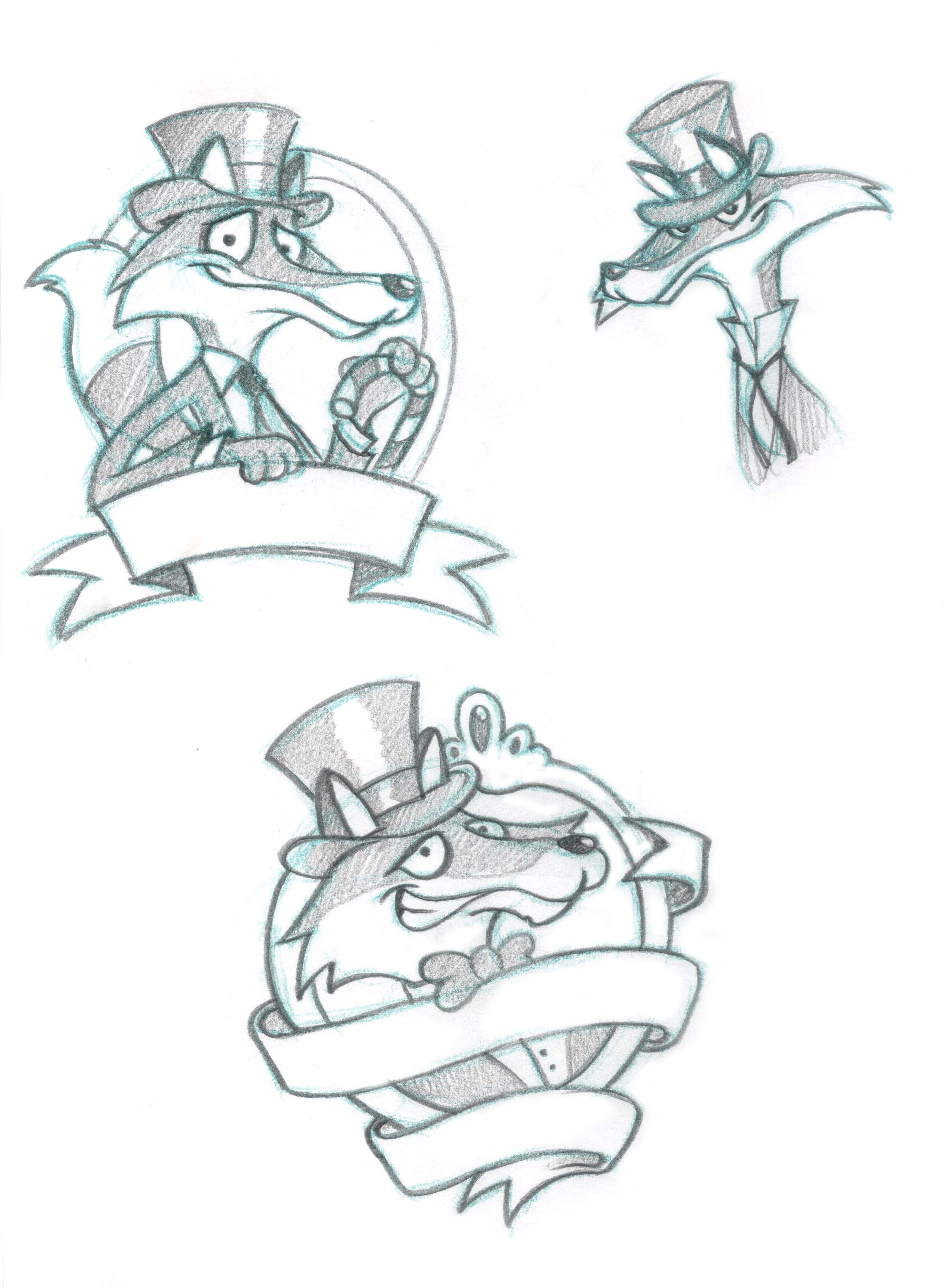
Check out the initial character sketches below, and some of the alternative poses and character styles we tried.
Lip-smackingly lovely logo
The 'Selection Fox' logo came next (which is unusual but not unheard of). The logo needed to have obvious design links with the character, but be a standalone identity in it's own rights.
We found a font that conveyed the right 'feel' for the brand, and added the top hat and fox tail to add the unique elements from the character.
A purple and orange colour scheme was used to continue the theme set by the character design. The 'classic' British sweets were added as a background with some liquorice allsorts, cola bottle and shrimp taking pride of place. The drop shadow effect was used to make the logo jump off the page a little.
A couple of variations of the logo were also created for possible alternative usage.
As usual I'd love to know what you think. Leave a comment or send me a message. Enjoy :)


