
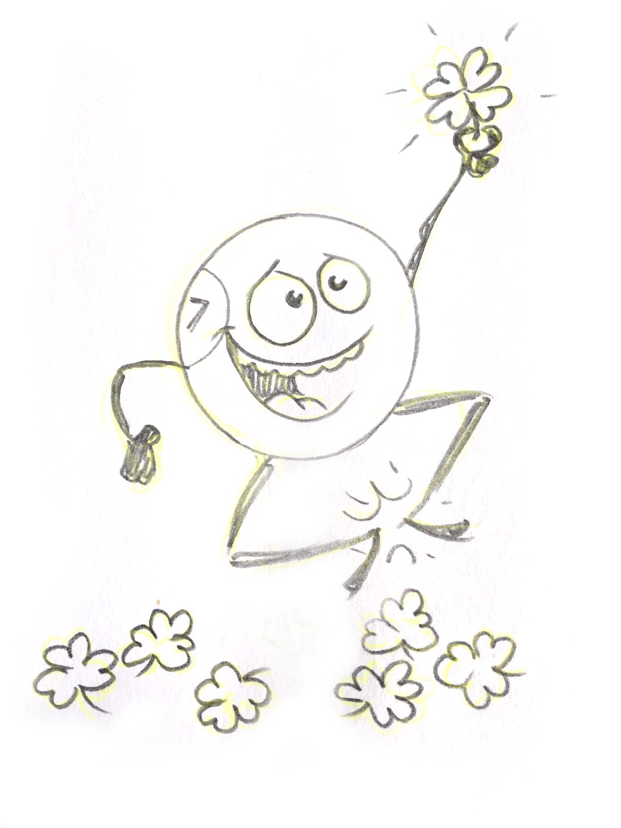
BINGO! Lucky number 7!
Eyes down for a brilliant bingo based Project
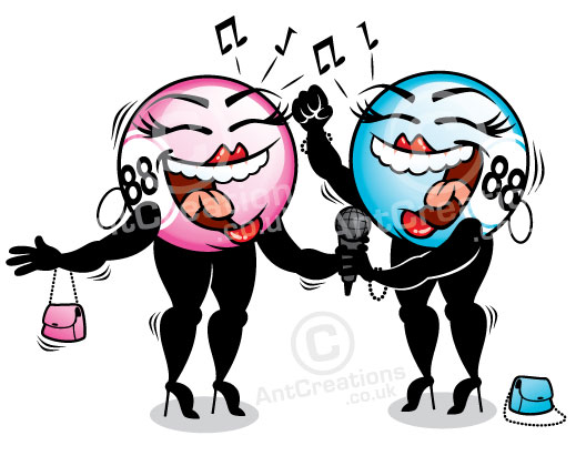
I've recently worked on a great project for Gala Bingo. working together with a fab design company from Leicester called Work Design. We produced a fun promotional calendar to hang on peoples walls and help promote Gala Bingo for the whole year.
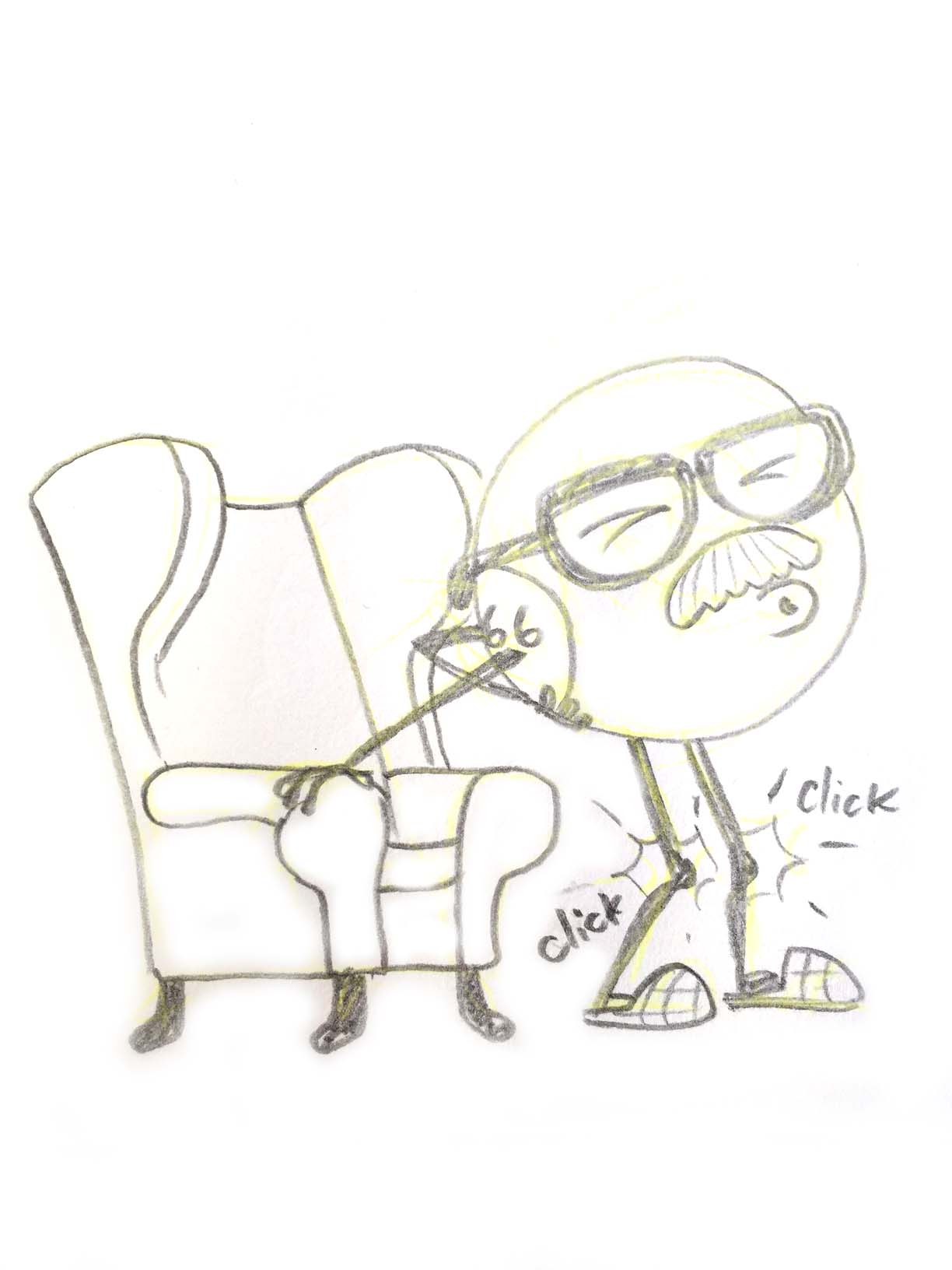
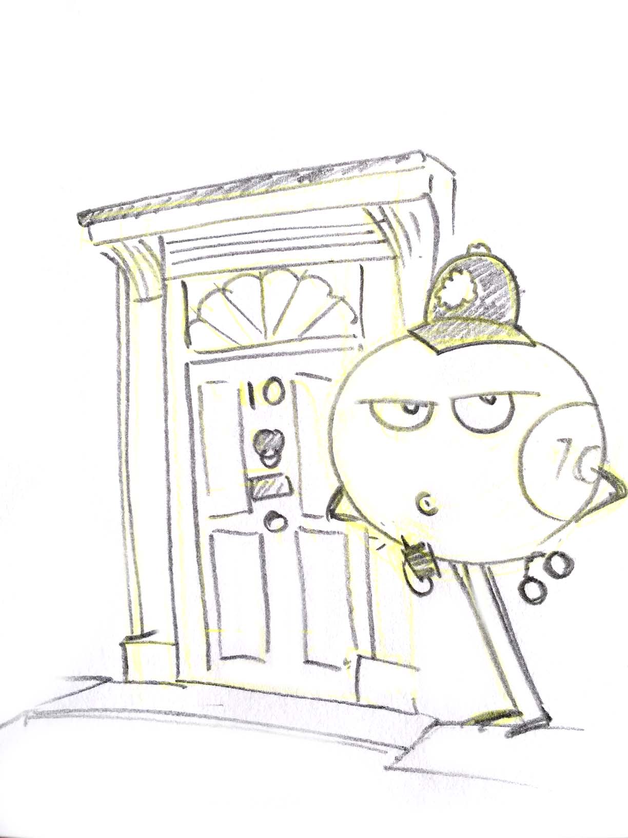
I was asked to create the 12 illustrations used on the calendar, and they are all based on the most popular bingo calls. Any bingo officionados out there will know the common and quirky calls used in bingo halls all over the world, but if you need reminding of the full list you can check out this extensive Wikipedia page.
The final twelve we chose needed to be fairly family friendly as they have to appeal to a broad audience of Gala Bingo regulars. The final twelve bingo calls chosen are:
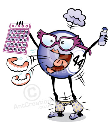
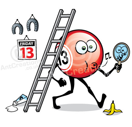
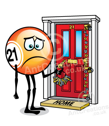
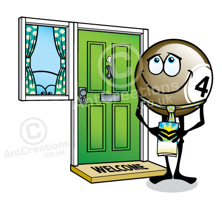
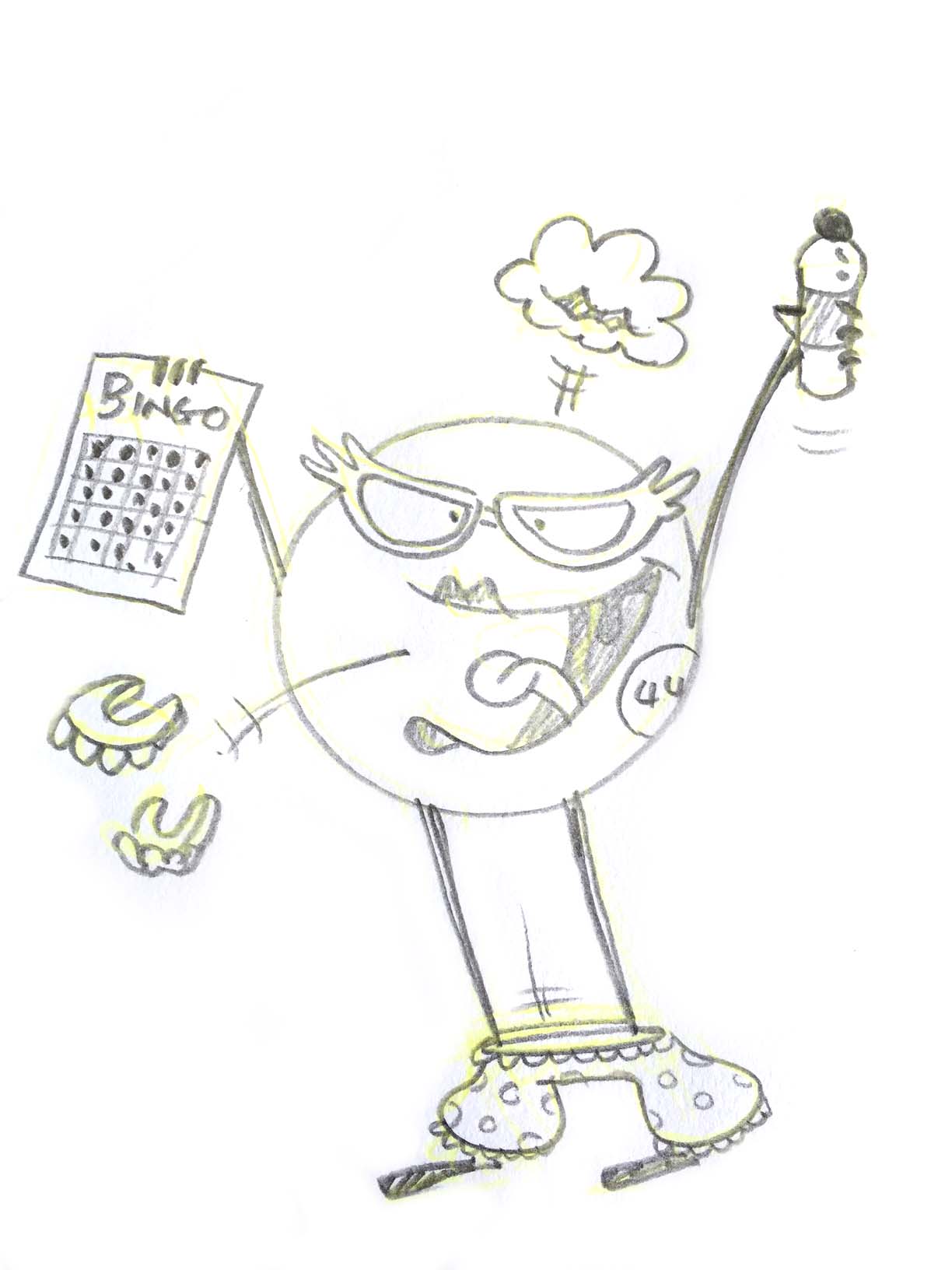
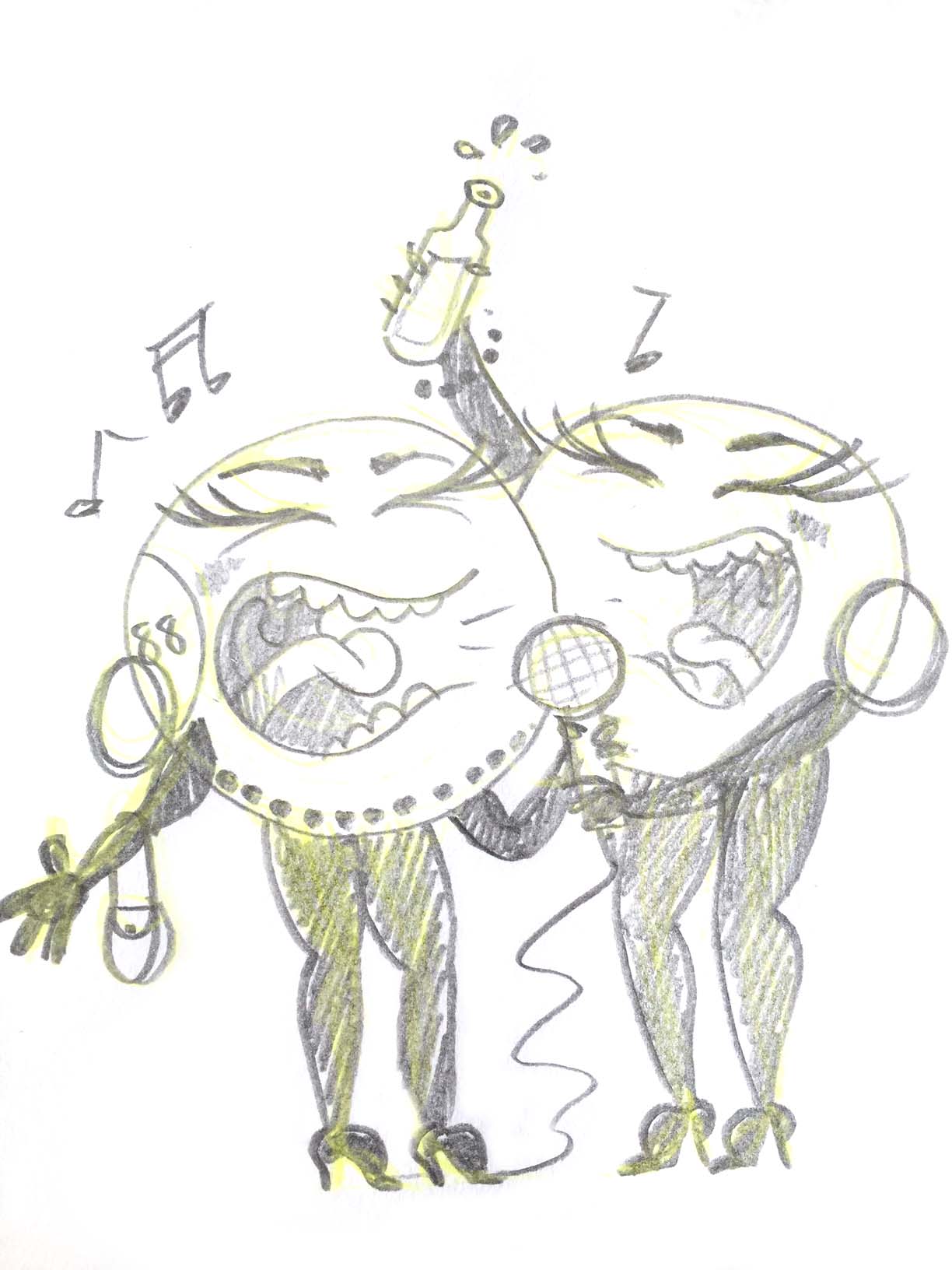
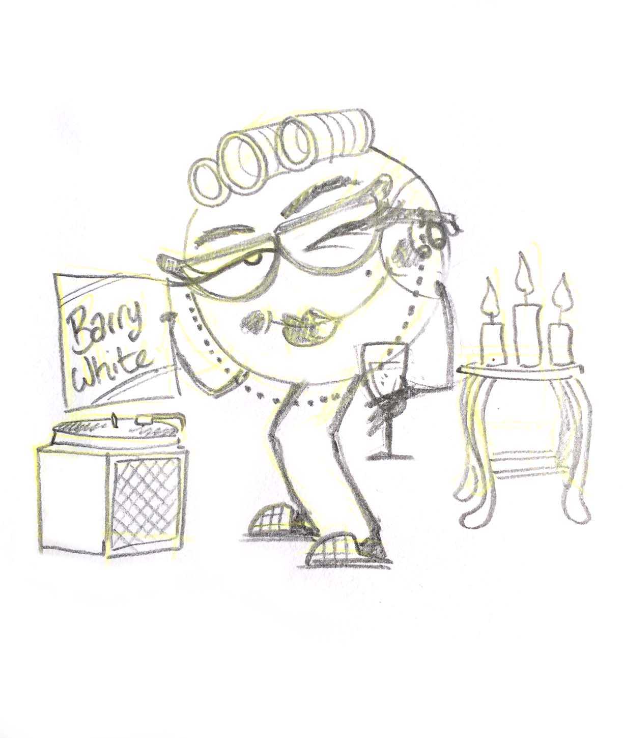
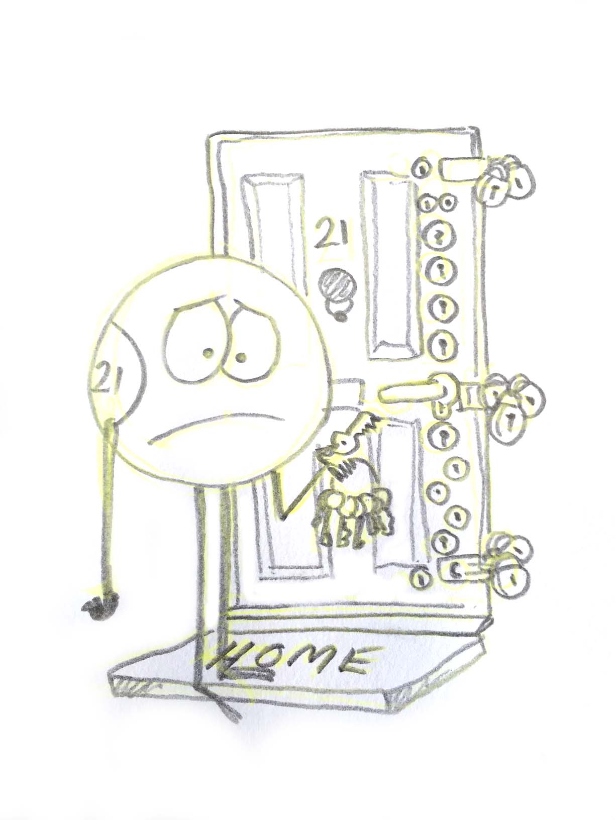
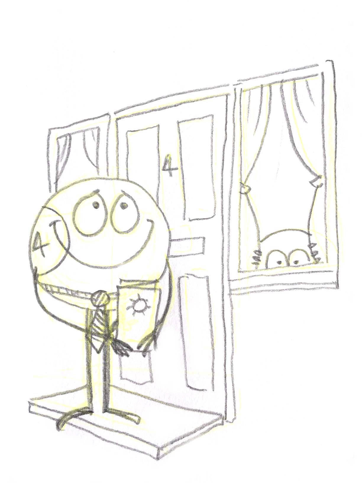
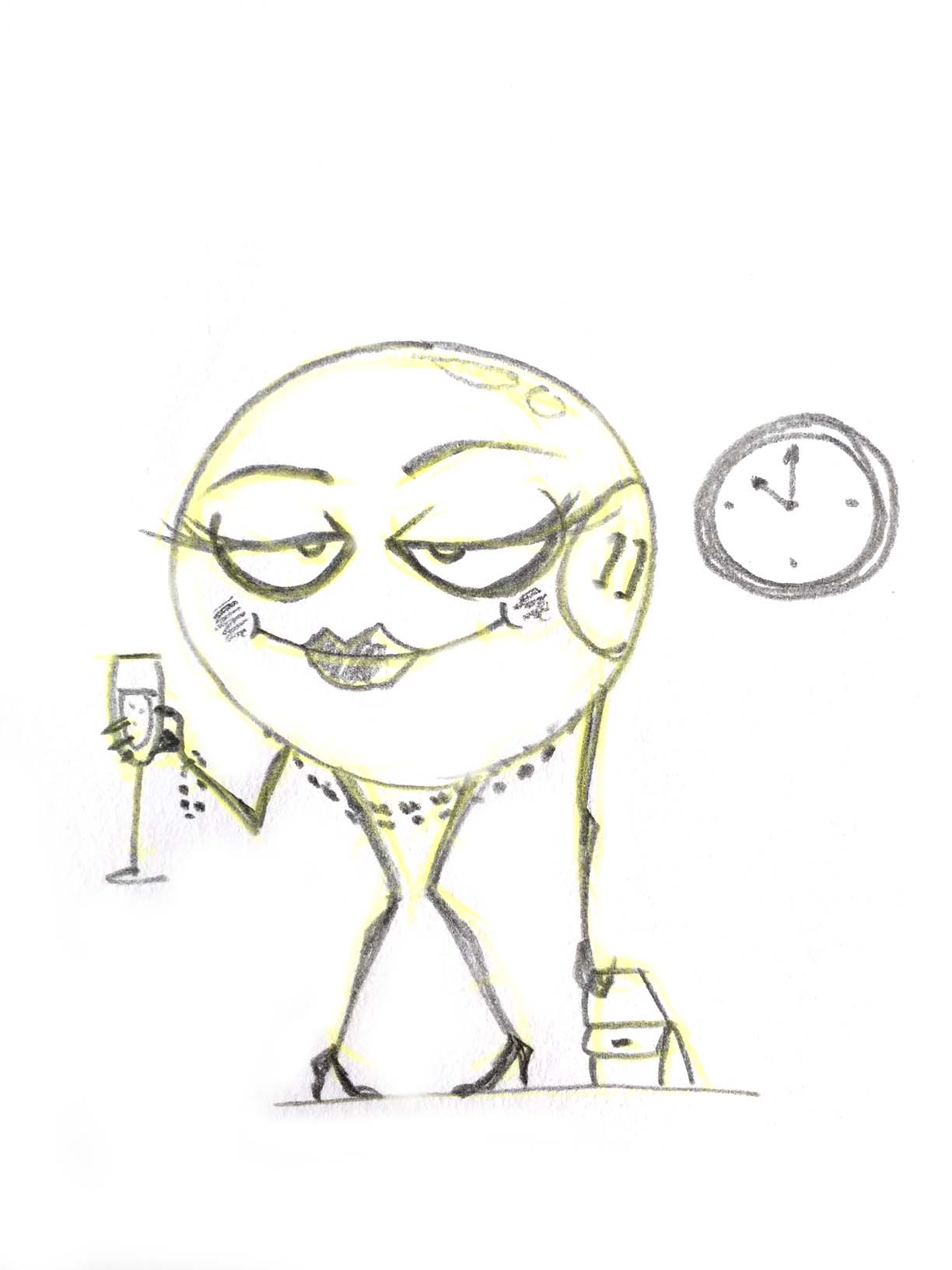
Legs 11, Knock on the door 44, Lucky7, Kelly's eye 1, David's den 10, Droopy drawers 44, Unlucky for some 13, Clickety click 66, Two fat ladies 88, Key to the door 21, Doctors orders 9, Two little ducks 22.
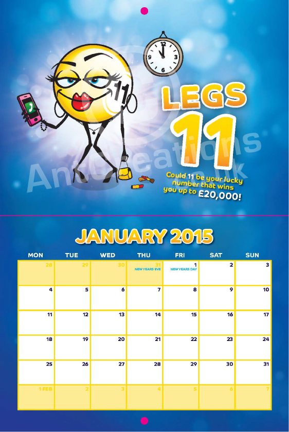
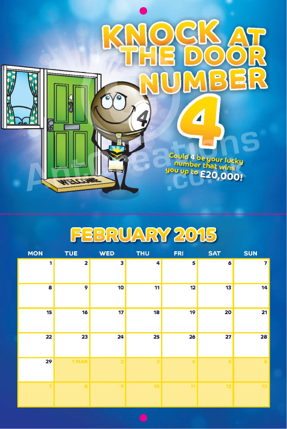
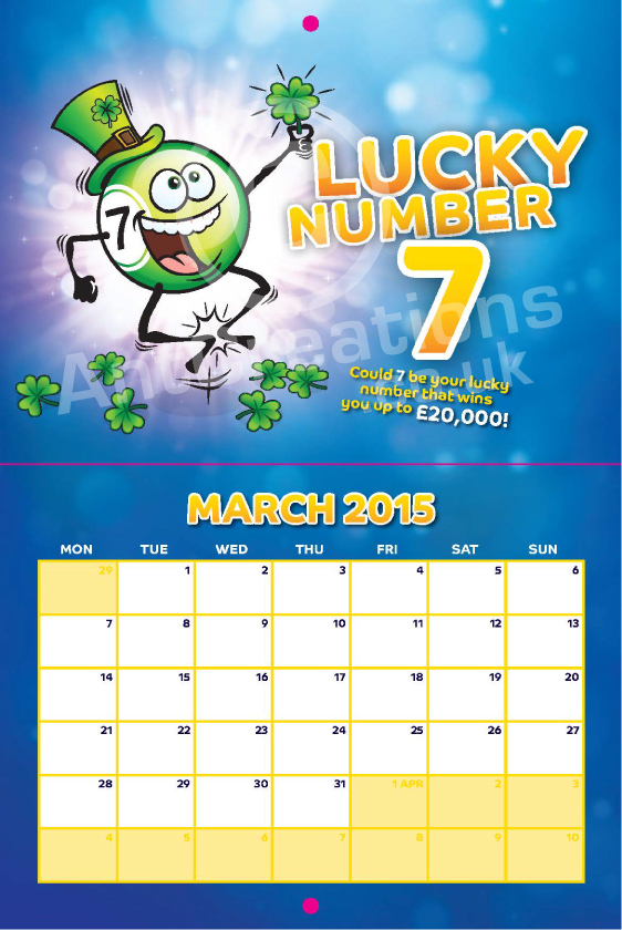
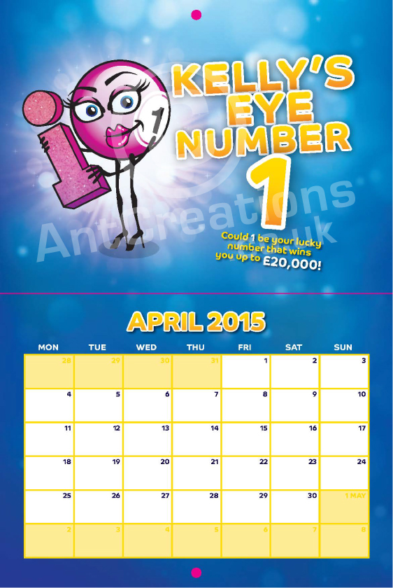
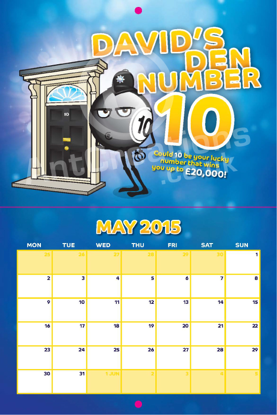
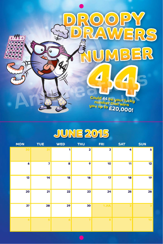
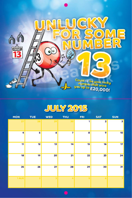
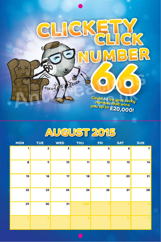
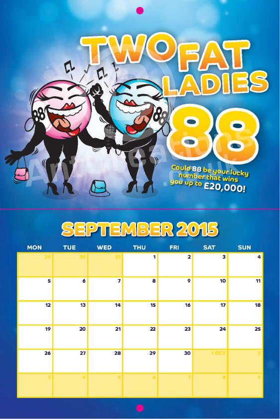
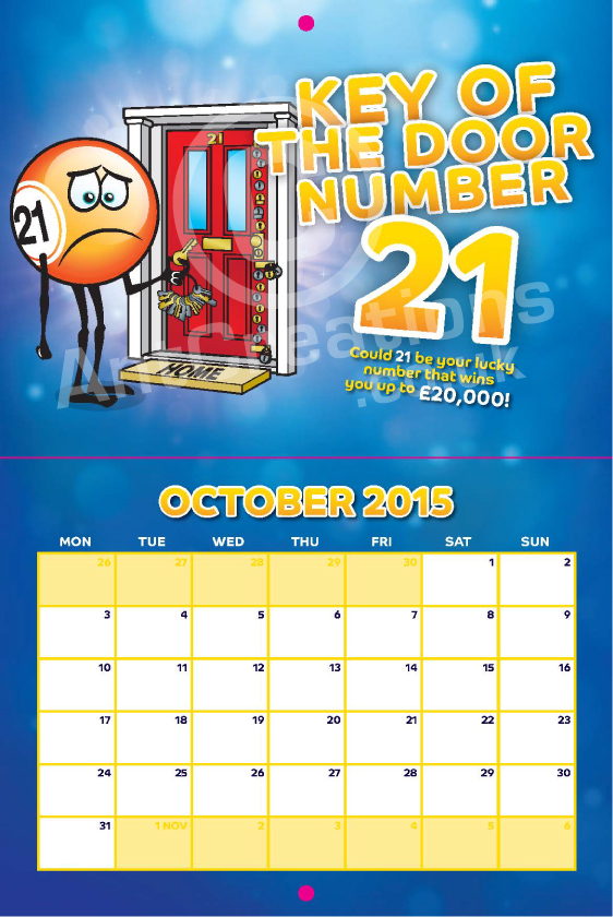
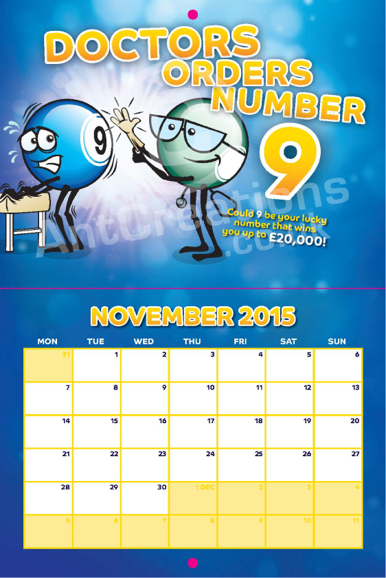
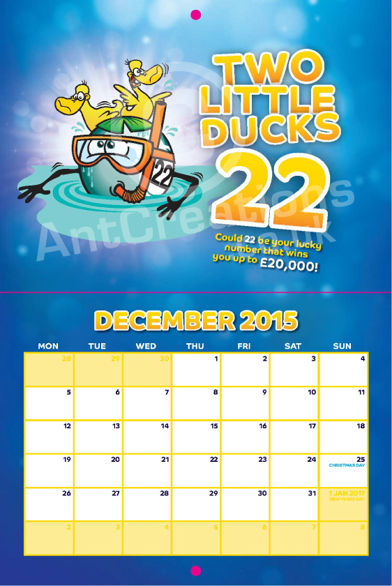
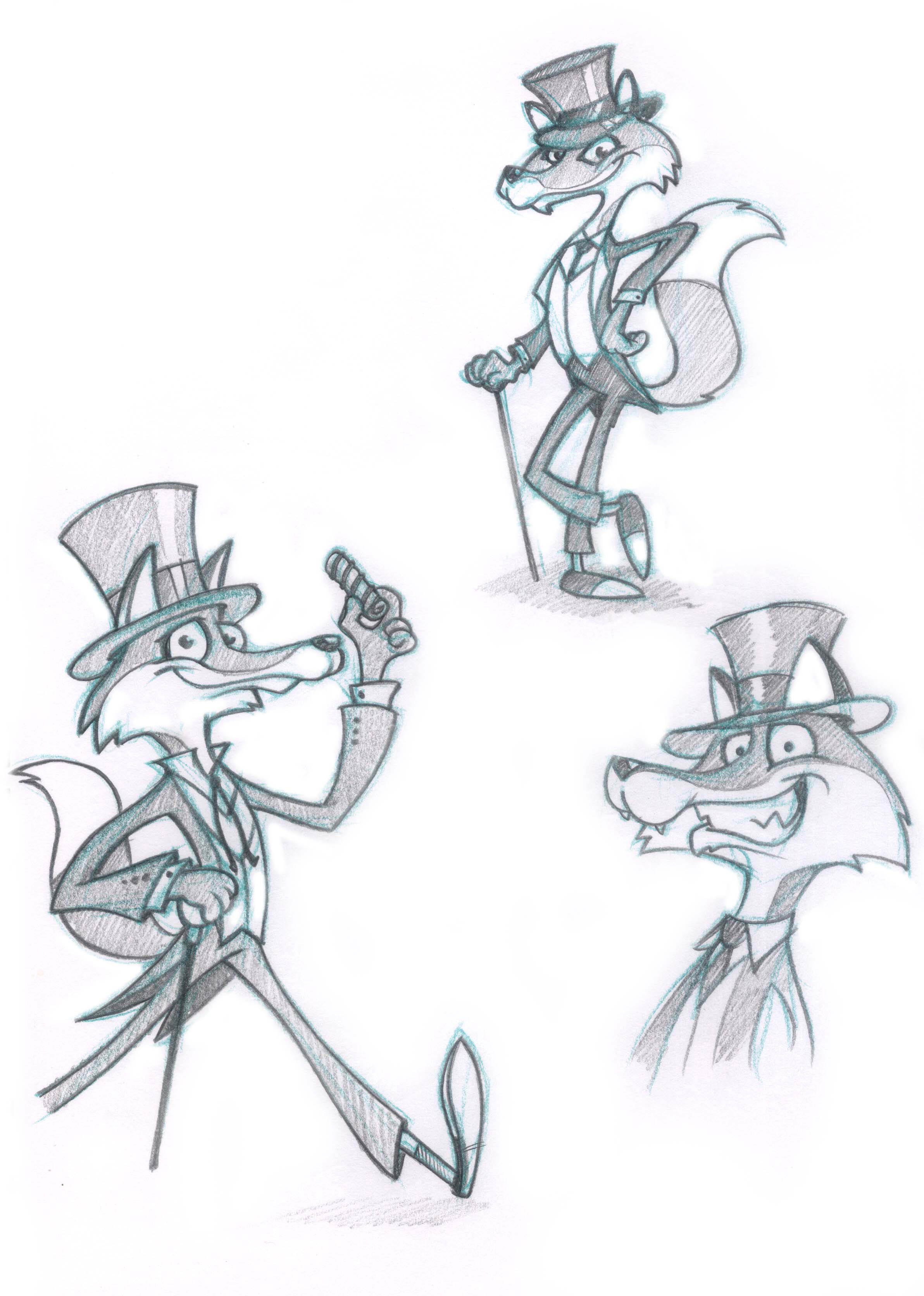
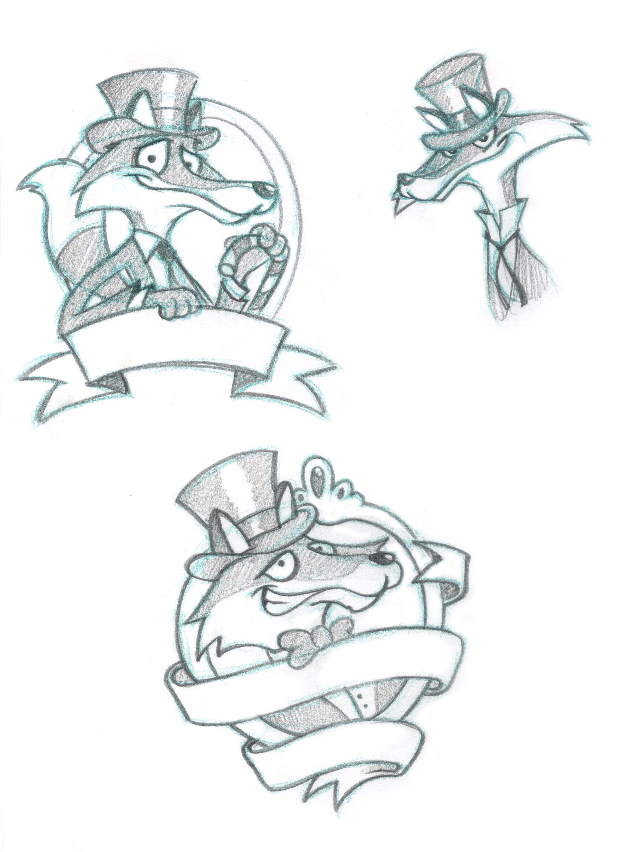
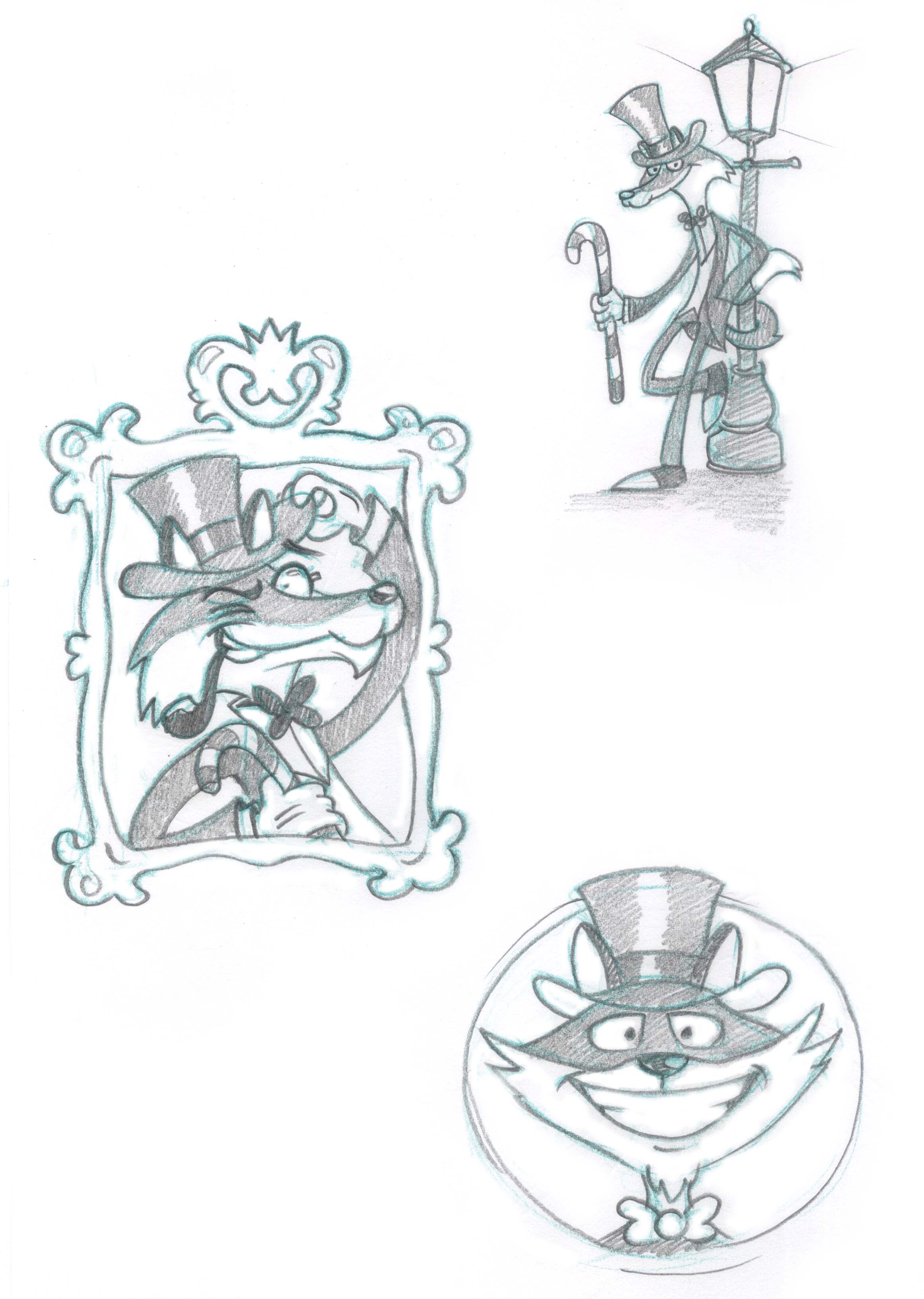
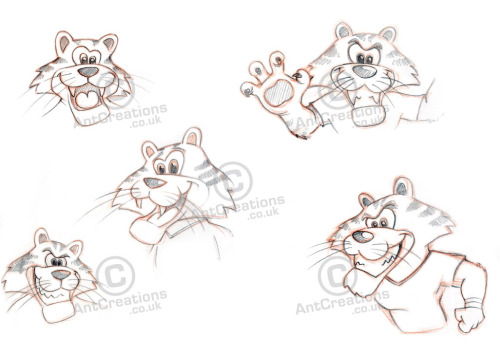
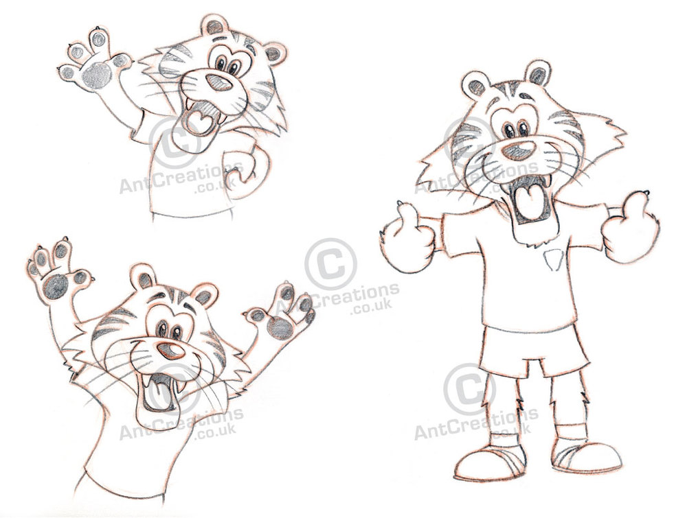
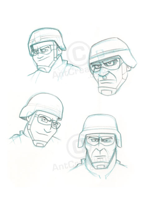
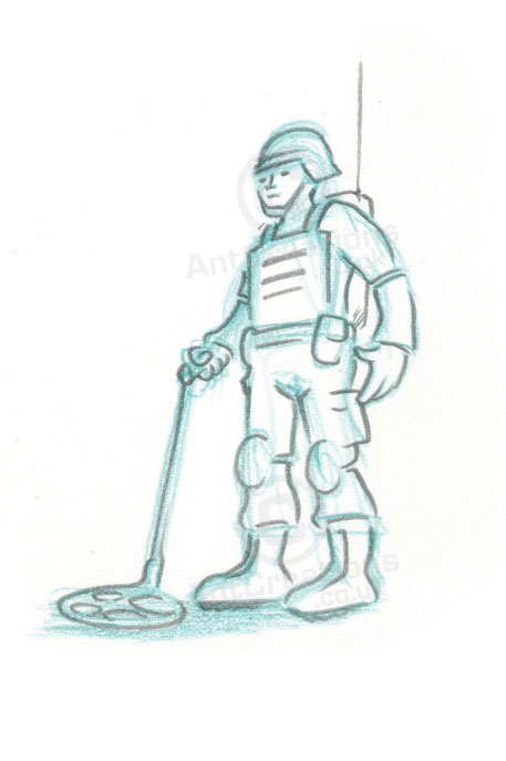
You can see the final calendar design in the gallery above. Work Design have done a great job with the graphics and the colours and background details really make the illustrations pop! You can see the early sketches and all the character illustrations below with plain backgrounds (lucky 7 above).
Let me know what you think if you fancy leaving a comment, or feel free to contact me about this project or any other. Enjoy :)