• Home
  • About
    • About
    • What to expect
    • What is Vector Art
    • Illustration Licensing
    • Prices
    • Testimonials
    • News
    • Using EPS Files
    • Content Licence Agreement
    • Terms & Conditions
    • History
    • News & Eye Treats Newsletter
  • Shop
    • Stock Vector Shop
    • T-Shirts & Merch
    • Amazon Shop
  • What I do
    • Vector Illustrator
    • Children's Book Illustrator
    • Character Mascot Design
    • Greeting Card Illustration Design
    • Cartoon Strips
    • Logo Design
    • Graphic Design
    • Colouring Books
    • Beer Label Pump Clip Design
  • Clients
    • Clients
    • Leicester Tigers
    • The Healthy Mutt
    • Gorilla Tubs
    • Gala Bingo
  • Advice
  • Gallery
    • Illustration
    • Character Design
    • Cartoons
    • Logo Design
    • Graphic Design
    • Videos
  • Contact Me
Vector Illustrator | Cartoons | Characters | Graphic Designer

Illustration, Cartoons, Character Creation, Mascot Design, Graphic Design

  • Home
  • About
    • About
    • What to expect
    • What is Vector Art
    • Illustration Licensing
    • Prices
    • Testimonials
    • News
    • Using EPS Files
    • Content Licence Agreement
    • Terms & Conditions
    • History
    • News & Eye Treats Newsletter
  • Shop
    • Stock Vector Shop
    • T-Shirts & Merch
    • Amazon Shop
  • What I do
    • Vector Illustrator
    • Children's Book Illustrator
    • Character Mascot Design
    • Greeting Card Illustration Design
    • Cartoon Strips
    • Logo Design
    • Graphic Design
    • Colouring Books
    • Beer Label Pump Clip Design
  • Clients
    • Clients
    • Leicester Tigers
    • The Healthy Mutt
    • Gorilla Tubs
    • Gala Bingo
  • Advice
  • Gallery
    • Illustration
    • Character Design
    • Cartoons
    • Logo Design
    • Graphic Design
    • Videos
  • Contact Me

Suave & sophisticated fox character and logo design for Selection Fox

Sweet character and logo design project

Selection Fox - Dapper fox in his stripy socks!

Selection Fox - Dapper fox in his stripy socks!

I recently had the pleasure to work on a great new character and logo design for a fantastic new company named 'Selection Fox'. 

The business is an online sweet / candy ordering service. You choose your favourite tasty treats and they'll pick, pack and post the parcel of perfection direct to you - Awesome!

The name is obviously a play on the traditional 'selection box'. Therefore with a small leap of creative genius 'Selection Fox' was born.

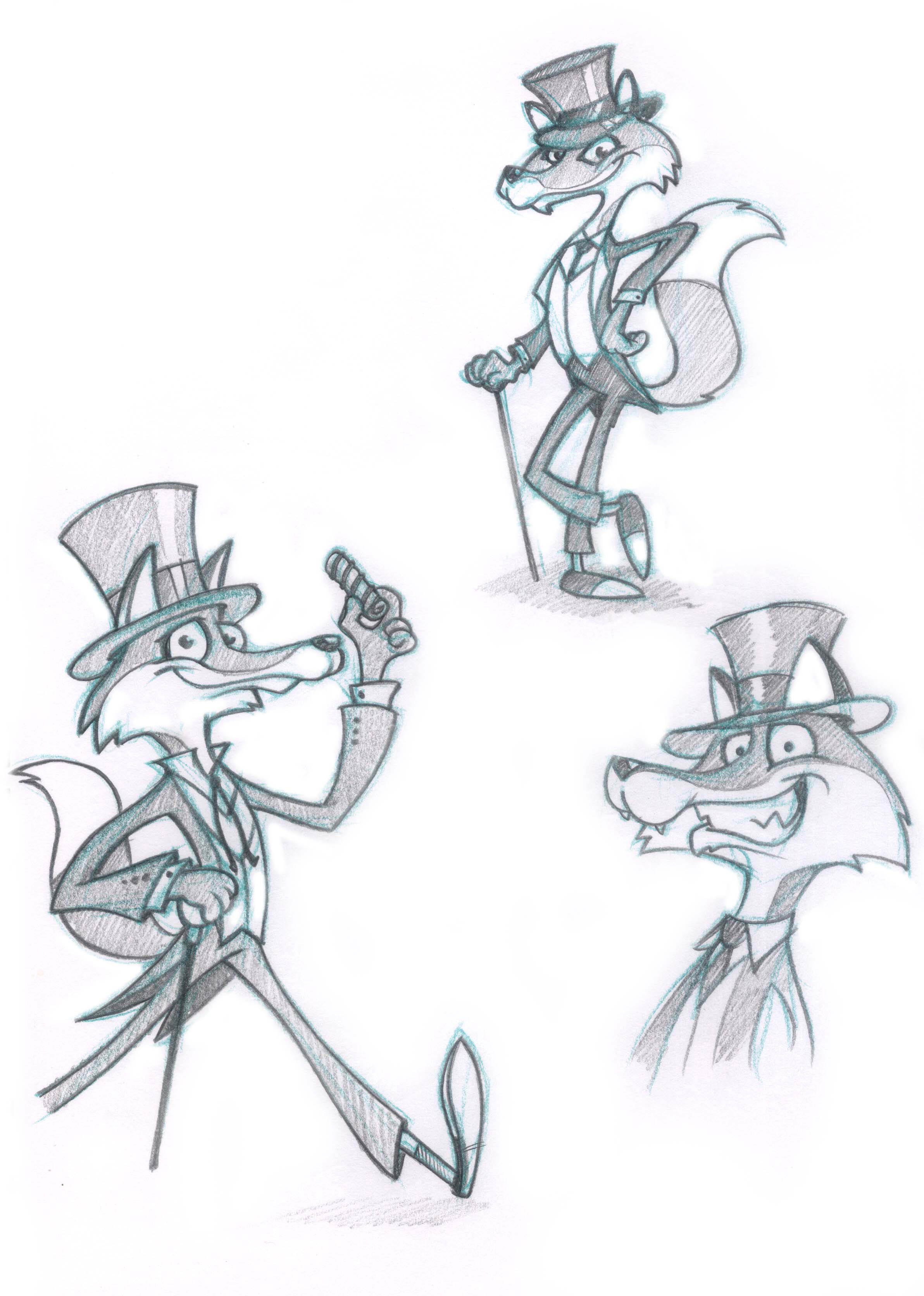
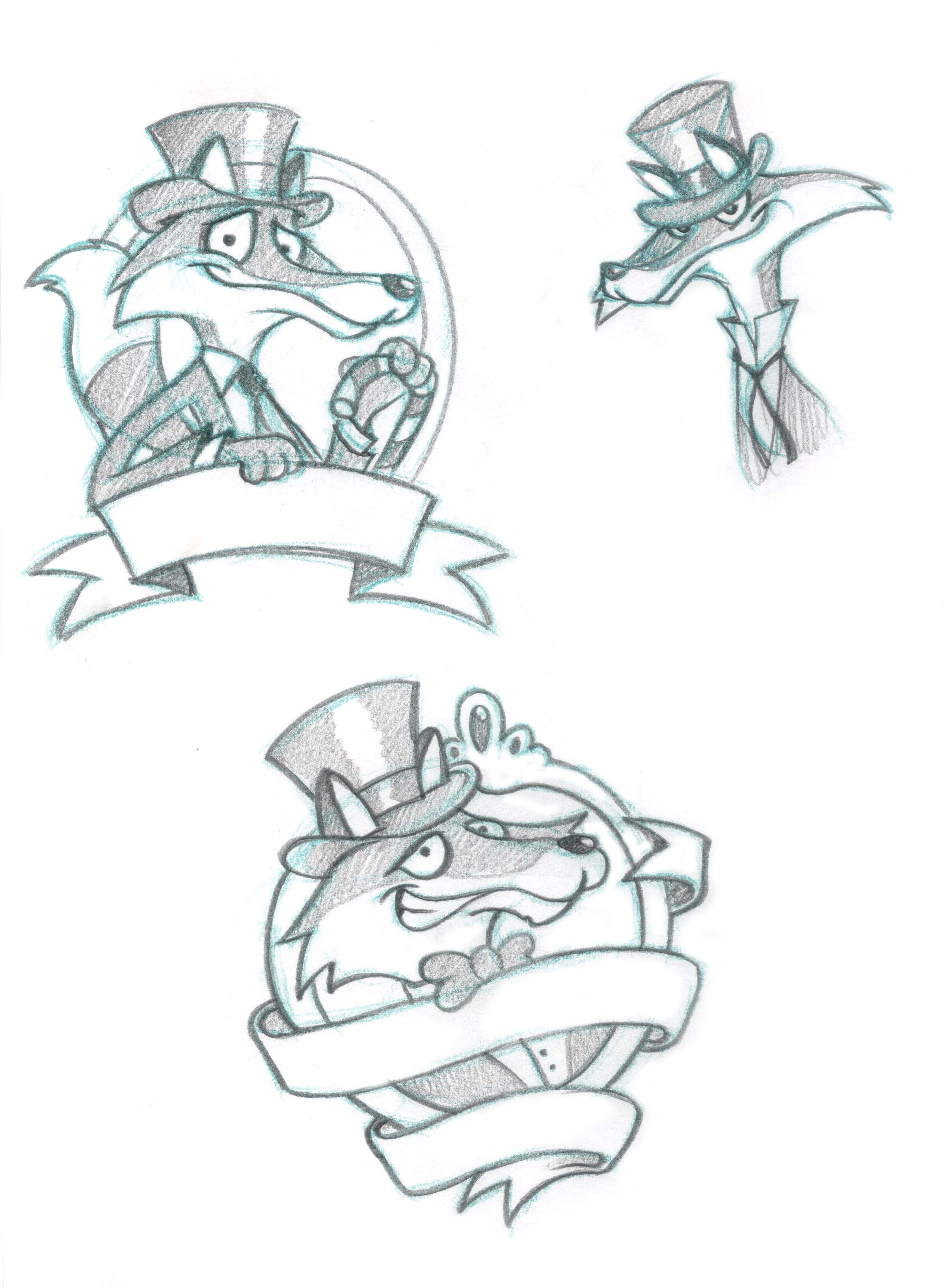
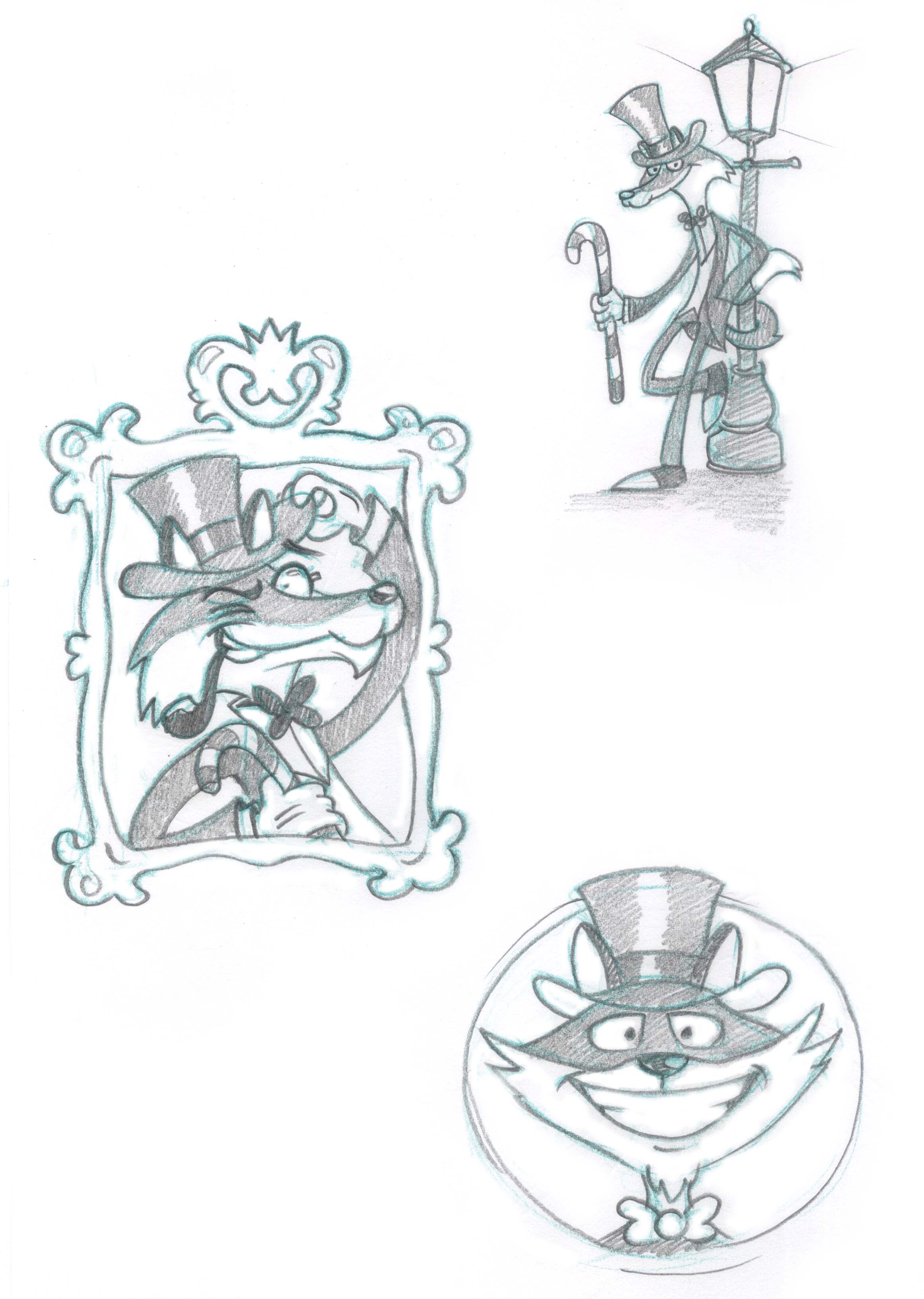
Our new character needed to be (a) a fox and (b) a suave, sophisticated and cool as candy old school dandy :)

The top hat and tails seemed an obvious choice, with the candy cane, sweet bow tie and liquorice pipe finishing off his sophisticated demeanour.

Purple was an obvious choice of colour next to the foxy orange hues, and all that was left was to add a giant liquorice allsort in his other hand. And lastly what dapper fox would be seen without his super, stripy socks?! 

Check out the initial character sketches below, and some of the alternative poses and character styles we tried.

FoxySketches01.jpg
FoxySketches02.jpg
FoxySketches03.jpg

Lip-smackingly lovely logo

The 'Selection Fox' logo came next (which is unusual but not unheard of). The logo needed to have obvious design links with the character, but be a standalone identity in it's own rights.

We found a font that conveyed the right 'feel' for the brand, and added the top hat and fox tail to add the unique elements from the character.

A purple and orange colour scheme was used to continue the theme set by the character design. The 'classic' British sweets were added as a background with some liquorice allsorts, cola bottle and shrimp taking pride of place. The drop shadow effect was used to make the logo jump off the page a little.

A couple of variations of the logo were also created for possible alternative usage.

SelectionFox_Logo_Own_Shadow.png
SelectionFox_Logo_wFoxy_Shadow.png

As usual I'd love to know what you think. Leave a comment or send me a message. Enjoy :)

tags: Fox, Sweet, Character Design, Cartoon Pose, Logos, Logo Design, Graphic Design
categories: Character Design, Corporate
Friday 11.13.15
Posted by Nathan Shelton
 

Scientist Character Design - Empiribox Logo and Illustrated Cartoon Scientist

AntCreationsScientist01.jpg

Mad Scientist - character design

AntCreationsScientistSketches.jpg

If I asked you to picture a cartoon scientist you would undoubtedly imagine the white coat, big glasses/goggles and some crazy hair of some kind. Add in some bubbling, smoky liquid in a test tube and you've got your typical scientist (mad scientist) character.

This is exactly what the client needed, so who am I to argue with tradition?! I did create a choice of other scientist sketches following the similar theme, and a favourite was chosen and vectored up to final artwork. Let me know what you think or if you'd have preferred a different scientist from my sketches.

Scientist_Sketch03.jpg Scientist_Sketch04.jpg Scientist_Sketch05.jpg Scientist_Sketch06.jpg Scientist_Sketch07.jpg Scientist_Sketch08.jpg

Empiribox Logo - design, animate and icon amends

Following the scientist character design, I also helped work on the company logo a little by developing the icons used amongst the text. As you can see the logo incorporates a rocket ship, a test tube and a bug. I designed a few variations of each icon and tried several colour schemes.

We also tried to get a bit of extra fun into the logo and decided to have a little play with animating the logo for the website. You can see the simple animated logo below.


Empiribox_Icons_Bugs.jpg Empiribox_Icons_Rockets.jpg Empiribox_Icons_TestTubes.jpg

If you have any thoughts, comments, suggestions or questions then please feel free to comment below or contact me in whatever way is best for you. Enjoy :)

tags: Cartoons, Character Design, Experiment, Science, Scientist, Sketches, Test Tube, Logos, Rocket, Bug
categories: Character Design, Illustration / Cartoons, We Are Epic, Logo Design, Logos
Monday 10.19.15
Posted by Nathan Shelton
 

Eye Kettleby Lakes Logo Design - Corporate Identity Branding

AntCreationsEyeKettlebyLakesLogo.jpg

I created a new logo for Eye Kettleby Lakes a little while back. Eye Kettleby Lakes is situated in the heart of the Leicestershire countryside on the outskirts of Melton Mowbray. It's a family run fishery set in 150 acres which also has 12 luxury round log cabins and a tranquil touring park. A new corporate identity was needed and a whole new logo as we were starting from scratch due to there being no previous logo design for the company.

The brief was initially quite broad, and we were unsure whether to use an icon related to fishing, log cabins or caravans etc. Following several stages of design it was decided to be more broad in the choice of icon. We did not want the logo to be too restrictive with regards to the 'topic' of any image or icon used, and by being a little more open in our approach with the theme it would 'future proof' the logo as much as possible to cover all the various aspects of the business.

Below you can see several stages of the design proces, mocked up on compliment slips or business cards along with some slight variations of each theme. We actually went through many other designs, tweaks and colour schemes but these should give an overall picture of the project as a whole

AntCreationsEyeKettlebyLakesLogos01.jpg
AntCreationsEyeKettlebyLakesLogos02.jpg
AntCreationsEyeKettlebyLakesLogos03.jpg
AntCreationsEyeKettlebyLakesLogos04.jpg

The final design was chosen to incorporate a tree icon. This was felt to be broad enough in it's theme and covered the countryside and 'back to nature' ethos of the company. I've shown the final logo in black, but also a few variations with colour to show the diversity the logo has and how it can be displayed in different settings and colours etc. Let me know what you think and if you'd have chosen a different approach maybe. Cheers and enjoy! 

AntCreationsEyeKettlebyLakesLogos06.jpg
tags: Corporate, Eye Kettleby Lakes, Graphic Design, Logo Design, Logos, Tree
categories: Corporate, Graphic Design, Logo Design, Logos
Thursday 05.21.15
Posted by Nathan Shelton
 

New Logo Design for We Are Epic - Corporate Identity Branding

AntCreationsEpicLogo01.jpg

I was asked to help design the new corporate identity, logo for We Are Epic (Epic for short). I have been working with the Leicester based design company for some time, and therefore had a good idea of the type of business they are and what style of branding would work for them.

We worked closely together to come up with a text based design, simply concentrating on the word 'epic'. The new branding needed to be fresh but fun, with the ability to use the logo in many colour schemes including a single coloured version. I tried a variety of text styles in an attempt to get the 'feel' of the brand just right. You can see my first stage of designs on the image below with the blueish squares. I've also added my initial sketches so you can see exactly where my design process begins.

AntCreationsEpicLogos01.jpg
AntCreationsEpicLogos02.jpg
AntCreationsEpicLogosSketches01.jpg

The client then narrowed the choice to two potentials as you can see on the second pic. We also tried a few colour variations to see what worked for the future.

The final logo can be seen above in a single black colour. I think you'll agree there are some obvious links to perhaps an 80's style, but hopefully a more modern twist and different or advanced enough to stand the test of time. Let me know what you think or if you'd have chosen a different path. Cheers and enjoy!

Screen Shot 2015-05-18 at 14.23.49.png
tags: Corporate, Design Process, Logo Design, Logos, Text, We Are Epic
categories: Graphic Design, Logo Design, Logos, We Are Epic
Friday 02.27.15
Posted by Nathan Shelton
 

Grr's 2 Purr's logo design - The cat's whiskers, the dogs...

I had the pleasure of working with a great client recently creating a brand new logo for Grr's 2 Purr's. Grr's 2 Purr's (as the name suggests) specialise in services and products for both cats and dogs. They're based in The Langton Farm Shop just outside Market Harborough and provide a premium dog grooming service as well as selling loads of high quality products, accessories and treats for our favourite four legged friends!

You can see the full logo below and how it works across several colour schemes including black and white and the companies corporate colours. I've also added many of the initial early designs I created as alternatives to the one that was finally chosen. As usual I would love to know what you think, and if you have any comments feel free to leave your thoughts. Cheers and enjoy!


tags: Cat, Corporate, Dog, Grr's 2 Purr's, Langton Farm Shop, Logo Design, Logos, Pets
categories: Corporate, Graphic Design, Logo Design, Logos
Friday 03.21.14
Posted by Nathan Shelton
 

New Logo Design for Bibo - Drinks For Events

Here are several versions of the new Bibo logo recently created for the Kibworth based drinks for events, hire company. The basic 'Bibo' in the glass design is used throughout the branding, but the text and layout will change for the different ways the logo will be used. The logo can be used portrait or landscape and as a single colour. If you see it out and about then I would love to know about it. Enjoy!

tags: Bibo, Cocktail, Drinks, Events, Logos, Olive
categories: Logo Design
Thursday 02.28.13
Posted by Nathan Shelton
 

Naturally Naked Logo Design

I've once again been working with a fantastic client of mine named Marcie DeWolf. Marcie runs 'The Healthy Mutt' which provides top quality and totally natural pet food for dogs. We have worked together on several projects and you can see examples of our previous work in my 'case studies' section by clicking on 'The Healthy Mutt'.

This time however we've worked on a logo for a new business venture and pet product range called 'Naturally Naked'. The brief was to create a dog character that could work independantly or as part of the logo with text. We tried several dogs and many different colour schemes to try to get the right look and feel for both the dog and the lettering. The dog needed to be fun and healthy looking but somehow convey the 'naked' message without being offensive in any way. The text needed to be friendly, healthy and natural but also professional. Here's the logo in full colour...

And here is the dog on his own (complete with a branch and leaf to cover his nakedness)... 

You can also check out the sketches I created for the dog in different poses and with different expressions across his doggy chops by visiting my 'sketches' album at the official Ant Creations Facebook page. Enjoy!

tags: Branch, Dog, Leaf, Logos, Naked, Naturally Naked, The Healthy Mutt
categories: Logo Design, Logos
Tuesday 09.11.12
Posted by Nathan Shelton
 

VAT Wizard Character/Logo Design

I've been working on a mysterious and wise new character/logo design project recently. The business is called VAT Wizard and a character was needed that would be fun and memorable and could also be used as the company logo. After several sketched ideas (see here) I came up with the magic man below. He will appear on business cards and letterheads (coming soon) and on any adverts and promotional material for the company. I have created a couple of ads that are currently in print to promote the new business, and the new website is currently in development. As usual would love to know what you think. Enjoy!

tags: Advert, Crystall Ball, Logos, VAT Wizard, Wizard
categories: Logo Design, Logos
Friday 08.17.12
Posted by Nathan Shelton
 

The logo designs that didn't quite make it!

I've recently been busy adding a load of 'never before seen' artwork to my various portfolio galleries. There's quite a lot of new stuff in general, but especially in the 'logos' section of my portfolio.

When coming up with a logo for any company there's obviously a lengthy design process that involves lots of different thoughts, concepts, designs and ideas. This can sometimes lead to some extremely varied designs from which the client choose a favourite and eventual winner. The unwanted designs unfortunately get left behind whilst the one winning design gets developed into the final logo. Sometimes these 'losers' aren't necessarily bad, just simply not right!

So, rather than let these design orphans go unloved any longer I've decided to boost their confidence and give them their own galleries. Check them out and let me know whether you think the clients made the right decisions and chose the best logo for the job! Oh, and if you can give any of the orphans a good home then we can start the rehoming process immediately! Loser logos 01 and loser logos 02!

I would love to know what you think. Enjoy!


tags: Graphic Design, Logos
categories: Logos
Monday 11.14.11
Posted by Nathan Shelton
Comments: 2
 

New Logo for National Link Couriers

I have recently been working with National Link Couriers to help re-brand their business. They are a same day courier service operating in the Northamptonshire area. They have been in business for over twenty years and have decided that their logo and branding needed an overhaul. This is the final result...


The red and black colour scheme has been carried over from the initial logo and general company branding to add some continuity to the changes. The logo needed to convey a feeling of friendliness but also the simple message that your parcels will be delivered quickly.
We tried various solutions before settling on the cartoon type man. I have designed him to be usable as a stand alone icon, so here he is without the text...


Feel free to let me know what you think. If you need any more information please get in touch on 01858 462 779 or email nathan@antcreations.co.uk


tags: Corporate, Logos, National Link Couriers
categories: Logo Design
Tuesday 07.26.11
Posted by Nathan Shelton
 
Newer / Older