I was asked to help design the new corporate identity, logo for We Are Epic (Epic for short). I have been working with the Leicester based design company for some time, and therefore had a good idea of the type of business they are and what style of branding would work for them.
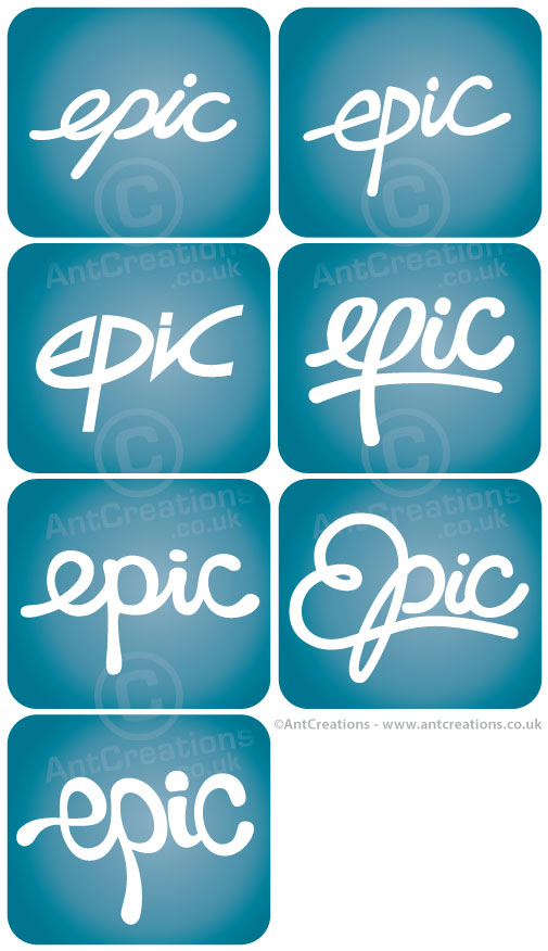
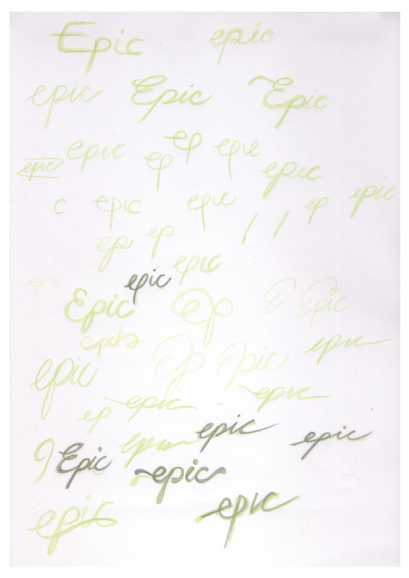
We worked closely together to come up with a text based design, simply concentrating on the word 'epic'. The new branding needed to be fresh but fun, with the ability to use the logo in many colour schemes including a single coloured version. I tried a variety of text styles in an attempt to get the 'feel' of the brand just right. You can see my first stage of designs on the image below with the blueish squares. I've also added my initial sketches so you can see exactly where my design process begins.
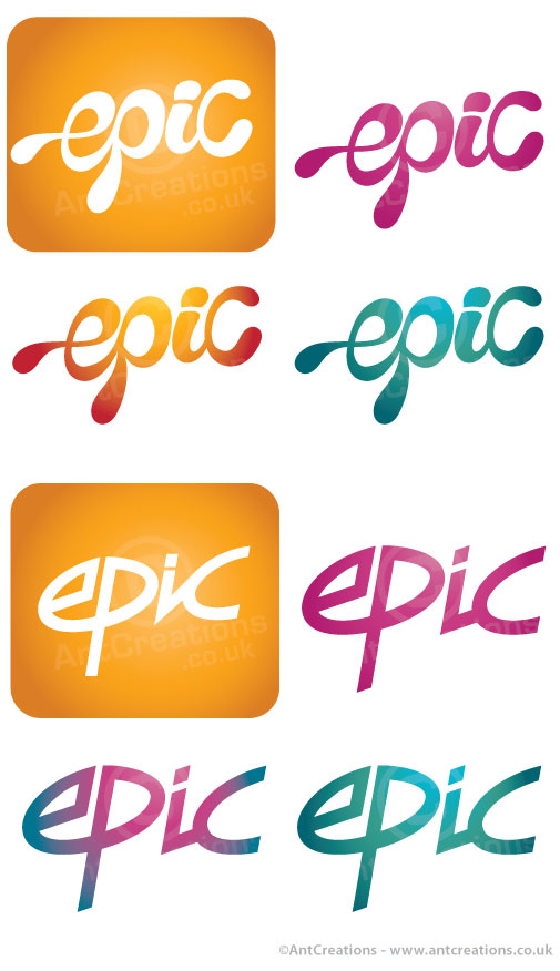
The client then narrowed the choice to two potentials as you can see on the second pic. We also tried a few colour variations to see what worked for the future.
The final logo can be seen above in a single black colour. I think you'll agree there are some obvious links to perhaps an 80's style, but hopefully a more modern twist and different or advanced enough to stand the test of time. Let me know what you think or if you'd have chosen a different path. Cheers and enjoy!


