I created a new logo for Eye Kettleby Lakes a little while back. Eye Kettleby Lakes is situated in the heart of the Leicestershire countryside on the outskirts of Melton Mowbray. It's a family run fishery set in 150 acres which also has 12 luxury round log cabins and a tranquil touring park. A new corporate identity was needed and a whole new logo as we were starting from scratch due to there being no previous logo design for the company.
The brief was initially quite broad, and we were unsure whether to use an icon related to fishing, log cabins or caravans etc. Following several stages of design it was decided to be more broad in the choice of icon. We did not want the logo to be too restrictive with regards to the 'topic' of any image or icon used, and by being a little more open in our approach with the theme it would 'future proof' the logo as much as possible to cover all the various aspects of the business.
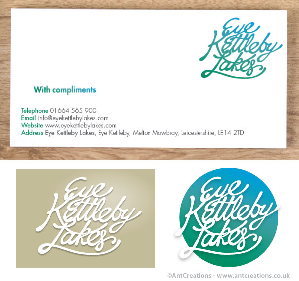
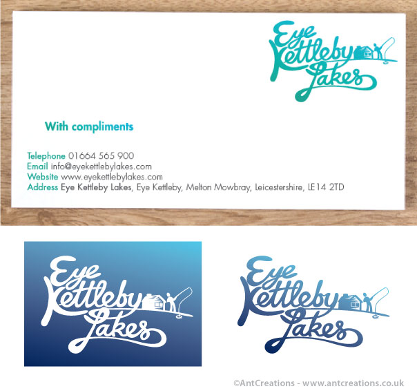
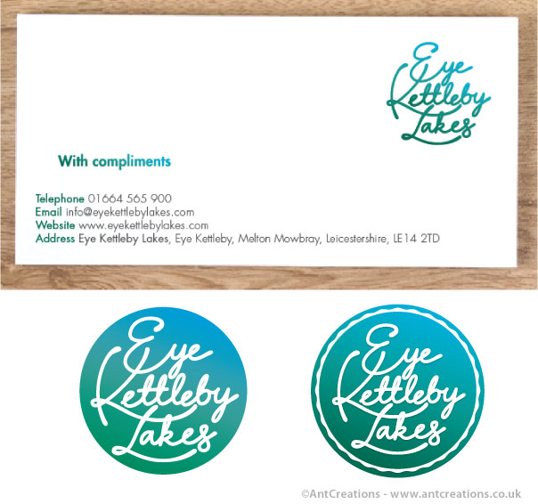
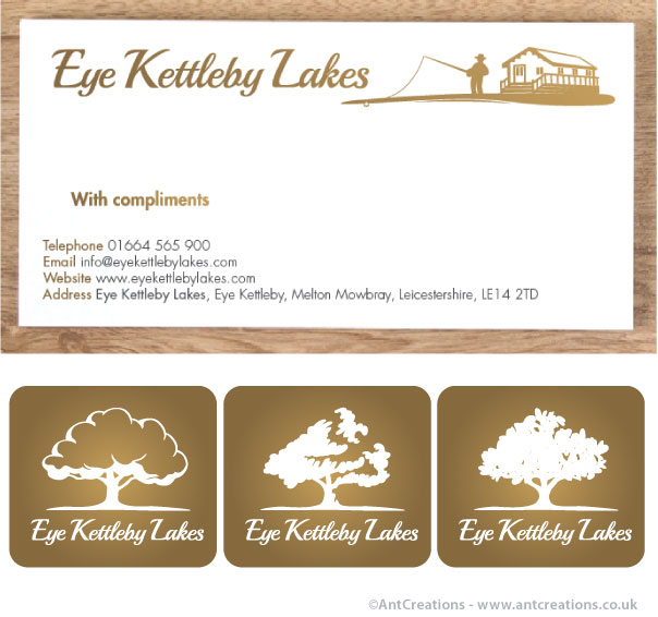
Below you can see several stages of the design proces, mocked up on compliment slips or business cards along with some slight variations of each theme. We actually went through many other designs, tweaks and colour schemes but these should give an overall picture of the project as a whole
The final design was chosen to incorporate a tree icon. This was felt to be broad enough in it's theme and covered the countryside and 'back to nature' ethos of the company. I've shown the final logo in black, but also a few variations with colour to show the diversity the logo has and how it can be displayed in different settings and colours etc. Let me know what you think and if you'd have chosen a different approach maybe. Cheers and enjoy!


