• Home
  • About
    • About
    • What to expect
    • What is Vector Art
    • Illustration Licensing
    • Prices
    • Testimonials
    • News
    • Using EPS Files
    • Content Licence Agreement
    • Terms & Conditions
    • History
    • News & Eye Treats Newsletter
  • Shop
    • Stock Vector Shop
    • T-Shirts & Merch
    • Amazon Shop
  • What I do
    • Vector Illustrator
    • Children's Book Illustrator
    • Character Mascot Design
    • Greeting Card Illustration Design
    • Cartoon Strips
    • Logo Design
    • Graphic Design
    • Colouring Books
    • Beer Label Pump Clip Design
  • Clients
    • Clients
    • Leicester Tigers
    • The Healthy Mutt
    • Gorilla Tubs
    • Gala Bingo
  • Advice
  • Gallery
    • Illustration
    • Character Design
    • Cartoons
    • Logo Design
    • Graphic Design
    • Videos
  • Contact Me
Vector Illustrator | Cartoons | Characters | Graphic Designer

Illustration, Cartoons, Character Creation, Mascot Design, Graphic Design

  • Home
  • About
    • About
    • What to expect
    • What is Vector Art
    • Illustration Licensing
    • Prices
    • Testimonials
    • News
    • Using EPS Files
    • Content Licence Agreement
    • Terms & Conditions
    • History
    • News & Eye Treats Newsletter
  • Shop
    • Stock Vector Shop
    • T-Shirts & Merch
    • Amazon Shop
  • What I do
    • Vector Illustrator
    • Children's Book Illustrator
    • Character Mascot Design
    • Greeting Card Illustration Design
    • Cartoon Strips
    • Logo Design
    • Graphic Design
    • Colouring Books
    • Beer Label Pump Clip Design
  • Clients
    • Clients
    • Leicester Tigers
    • The Healthy Mutt
    • Gorilla Tubs
    • Gala Bingo
  • Advice
  • Gallery
    • Illustration
    • Character Design
    • Cartoons
    • Logo Design
    • Graphic Design
    • Videos
  • Contact Me

New Logo Design for We Are Epic - Corporate Identity Branding

AntCreationsEpicLogo01.jpg

I was asked to help design the new corporate identity, logo for We Are Epic (Epic for short). I have been working with the Leicester based design company for some time, and therefore had a good idea of the type of business they are and what style of branding would work for them.

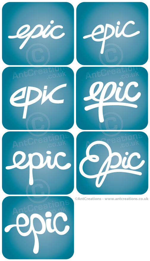
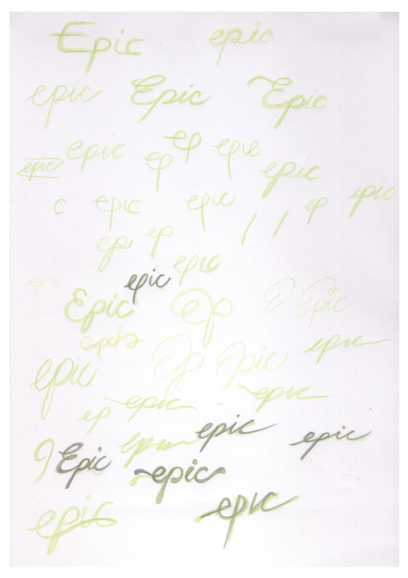
We worked closely together to come up with a text based design, simply concentrating on the word 'epic'. The new branding needed to be fresh but fun, with the ability to use the logo in many colour schemes including a single coloured version. I tried a variety of text styles in an attempt to get the 'feel' of the brand just right. You can see my first stage of designs on the image below with the blueish squares. I've also added my initial sketches so you can see exactly where my design process begins.

AntCreationsEpicLogos01.jpg
AntCreationsEpicLogos02.jpg
AntCreationsEpicLogosSketches01.jpg

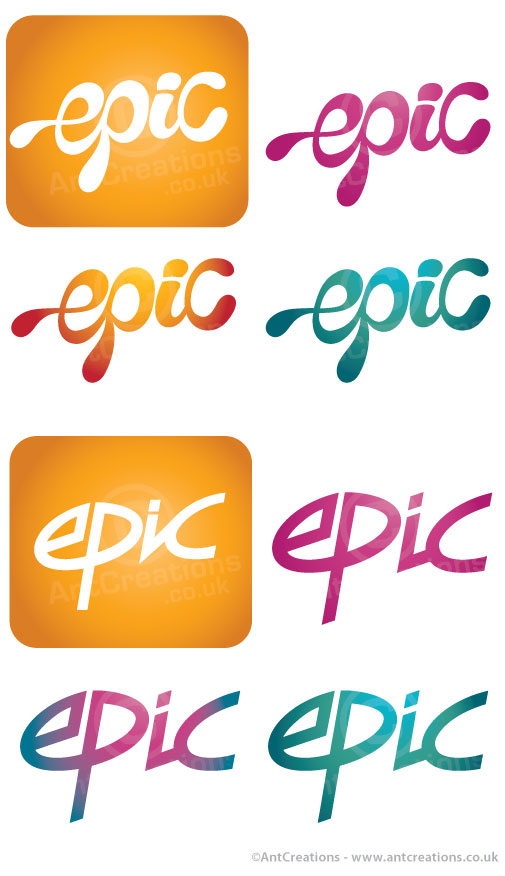
The client then narrowed the choice to two potentials as you can see on the second pic. We also tried a few colour variations to see what worked for the future.

The final logo can be seen above in a single black colour. I think you'll agree there are some obvious links to perhaps an 80's style, but hopefully a more modern twist and different or advanced enough to stand the test of time. Let me know what you think or if you'd have chosen a different path. Cheers and enjoy!

Screen Shot 2015-05-18 at 14.23.49.png
tags: Corporate, Design Process, Logo Design, Logos, Text, We Are Epic
categories: Graphic Design, Logo Design, Logos, We Are Epic
Friday 02.27.15
Posted by Nathan Shelton
 

Warning Zone - New Frog characters created!


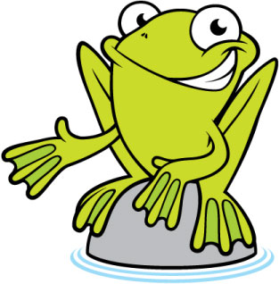
I have recently created a couple of new frog character designs on behalf of Warning Zone who are based on Frog Island in Leicester. A detective type frog was needed and also a version of the original frog (see this post for details) for use on a Christmas invitation.


I created a couple of sketches for the detective and then several slight variations during the vector stage of artwork. The frog above is the final version and the images below show the sketches and the vector varieties.


Below is the final version of the frog in a Christmas scene looking festive and jolly!


Let me know what you think and please feel free to  get in touch if you would like to discuss any artwork you may need creating. Call me on 01858 462779 or email me at nathan@antcreations.co.uk


tags: Animals, Character Design, Corporate, Design Process, Sketches, Warning Zone
categories: Illustration / Cartoons
Tuesday 09.13.11
Posted by Nathan Shelton
 

Nelson Skate and BMX Jam Logos, Posters, Flyers and More!

I created these logo's, promotional posters and flyers a little while back. It's taken me this long to get them on the blog because to be honest I forgot all about them!
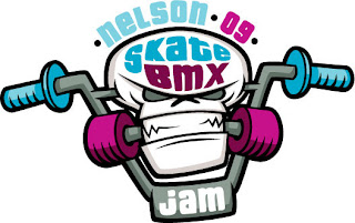
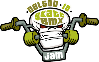
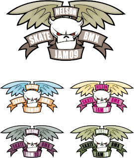
I did however really enjoy creating this artwork. The world of skating and bmxing is full of great images, illustrations and designs! This artwork was created to promote Nelson Skate and BMX Jam which is a day of fun and competition held in Nelson Skate Park in South Wales every year. A logo was required that represented the skate and bmx scene and would be useable year after year that would be changeable whilst keeping it's overall identity.
This is the logo I created for the 2009 competition and also the 2010 event. The different colour schemes and date show how it is adaptable and unique every year.


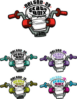
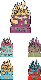
I created a few different designs for the logo before the final version was chosen. The images below show the initial design options and the various colour schemes


As I mentioned earlier I also created a poster and a flyer for the event. Because the event is held in my hometown of Nelson which is in the beautiful South Wales valley the posters and flyers needed to be created in both English and Welsh. Here are the final results for the posters and flyers

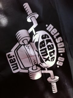
And if that's not enough cool and funky stuff already the client which was Caerphilly Borough Council also had some other promotional items created. Here are some pics of the shoulder bags and dog tags that incorporated the logo

Phew, long blog post eh! If you need any more info please get in touch by email at nathan@antcreations.co.uk or call me on 01858 462779.


tags: Cartoons, Corporate, Design Process, Graphic Design, Logos
categories: Logo Design
Thursday 03.17.11
Posted by Nathan Shelton
Comments: 1
 

Warning Zone - Their Frog on my Blog

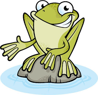
Warning Zone are a company based on Frog Island in Leicester. Due to the great name of their location it was decided to promote the business by using a frog character as a bit of a company mascot. The frog will be used in numerous places but especially on the website and in particular the blog which is aptly named 'The blog on the Frog'. A brand new happy frog character was therefore required to fulfill his promotional duties.
The frog needed to be a typical green frog that can be found anywhere in the UK. He needed to convey a positive persona without being too silly but also not too serious. A fun frog but not necessarily a funny frog. The initial design is of the frog sitting on a rock or a very small island (a frog island)! At a later date the character will also be developed further to incorporate different poses and props.  Here is the final full coloured result for the initial frog pose...


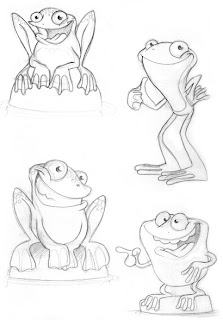
If you're interested to see how the character developed then please read on! As I mentioned earlier the frog will be in different poses in the future therefore the initial sketches are of a frog both standing and sitting. I created several sketches for the first stage and then some additional sketches following the feedback from the client.


One of the frog's were chosen as the favourite. With only a few minor changes needed I went straight to vector artwork and created the amendments on screen before sending the next stage to the client, a version of the character in black and white and also a version using a few flat colours.


Some minor changes were required after this stage, mainly the shape of the rock the frog was sitting on. It was a little too uniform and needed to be more irregular and rock like. Apart from the rock all that was left to do was to add the minor details such as skin patterns, highlights and obviously the correct colour schemes.

The final result (appearing higher in this post) can soon be seen on the Warning Zone website.


If you would like to know more details or discuss anything else including any projects where you may need a character designed then please call 01858 462779 or email nathan@antcreations.co.uk


tags: Animals, Cartoons, Character Design, Corporate, Design Process, Sketches, Warning Zone
categories: Character Design
Thursday 03.10.11
Posted by Nathan Shelton
 

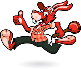
Red Rabbit Rooter Character Design

I thought I would change things a little on this blog, and hopefully add some extra interesting content. In the past I have only put an image of the final artwork on my blog. But from now on I am going to add the earlier stages of a project too.

These extra bits of artwork could be sketches and vector development work, as well as various colour choices, shading and highlights and the adding of little details etc.
I'm hoping these extra bits of info will help paint a clear picture of how a project develops from the initial idea right through the various stages of design until the final vector artwork is created.
This first project is a character design for Red Rabbit Rooter, which is a drainage/sewer company from Pennsylvania in the USA.

Brief
: A character needed to be created based on the Red Rabbit theme. He needed to be a positive happy face for the company and show quickness and speed, he also needed to be carrying a plunger to symbolise the sewer business.


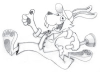
Initial Sketches :


Stage Two : Rabbit number 02 was chosen for development. It was decided to change the clothes worn by the rabbit to include longer trousers and a shirt.
 

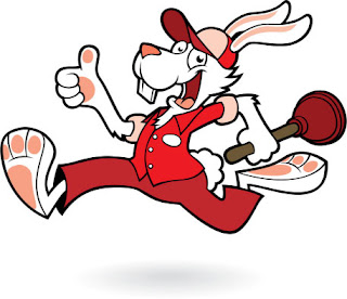
Stage Three - Vectors : Next stage was to create the vector artwork. As you can see there is a major difference between the sketches and the vector artwork. Everything suddenly looks a lot more polished. I find it easier to judge a character with a little bit of colour whilst also seeing a black and white version, hence I usually send my inital colour ideas as well as a B&W version of the character.



Stage Four - Colour and Details : With feedback from the client it was then possible to develop the colours whilst adding all the little details that bring the character to life.
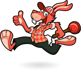
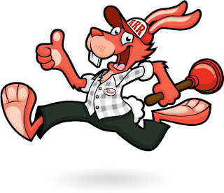


Final Character Design : With the shading and highlights added as well as all the little details such as his name badge and cap motif the character is now finished. All these little details really help bring the character to life and give him the personality he needs to appeal to his audience!

Here is the final character as he will appear in all his marketing and promotional duties. I am really pleased with the final outcome as was the client Jenna Peppler. I hope he does his job and helps to promote the company long into the future!


I introduce you to 'Red' the face of Red Rabbit Rooter...
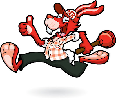


Please feel free to let me know what you think. If you need anything from me (Nathan Shelton) then please feel free to get in touch and I will be very happy to hear from you. Cheers!

Email nathan@antcreations.co.uk or call on 01858 462779


tags: Animals, Cartoons, Character Design, Corporate, Design Process, Sketches, Vector
Monday 11.01.10
Posted by Nathan Shelton
Comments: 1